Apple, a company, a brand, a feeling, an emotion. When apple was founded by Steve Jobs, Steve Wozniak, and Ronald Wayne in April 1976, no one will ever imagine that a company started in a garage will be a tech-giant one day. Apple is now ruling world with his iOS and popularity of Phones, iMac is just increasing day by day. Even after being very expensive, Apple is undoubtedly the most popular phone brand on the planet earth.
You can easily recognize its logo even if you are not an Apple user. But recognizing the logo and knowing the story and reasons behind the logo is totally different. You might know that the current Apple logo is not the very first Apple logo but the Apple logo has already gone through few makeovers over couple of times. But its design hardly seen any changes as Steve Jobs know that Logo is soul of the Brand.
If you want to know Why Apple logo is half Eaten read it here.
The Very-First Apple Logo
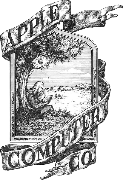
The very first Apple logo was designed by Ronal Wayne, co-founder of Apple, in 1976. The logo has Issac Newton sitting under a tree with dazzling Apple hanging over his head. That logo was replaced in the very same year as Jobs didn’t like that concept too much.
The Rainbow Logo
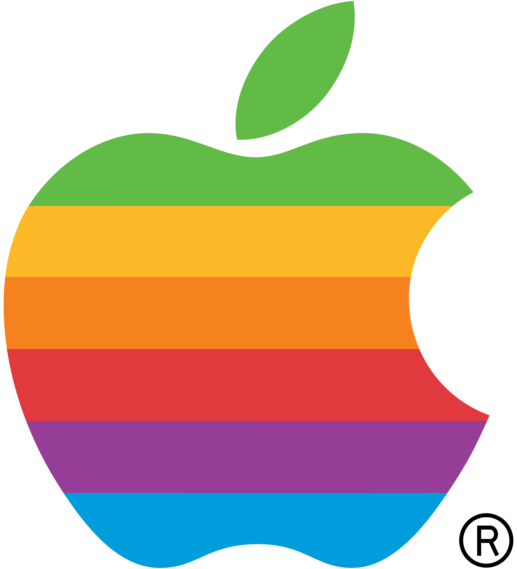
This was the logo that replaced the first logo in same year. Jobs assigned Rob Janoff, a graphic designer, the task to come up with something decent and cool design for the logo. In an interview, Janoff said he didn’t get any brief on how to design the Apple’s logo but Steve just asked him “not to make the logo cute”.
Asking reason for rainbow strips of the logo, Steve Jobs is rumored to have insisted on using a colorful logo as a means to “humanize” the company. Janoff then told that there was no particular reason behind the order of color strips. He only want green to be top “because that’s where the leaf was.”
The Translucent Logo
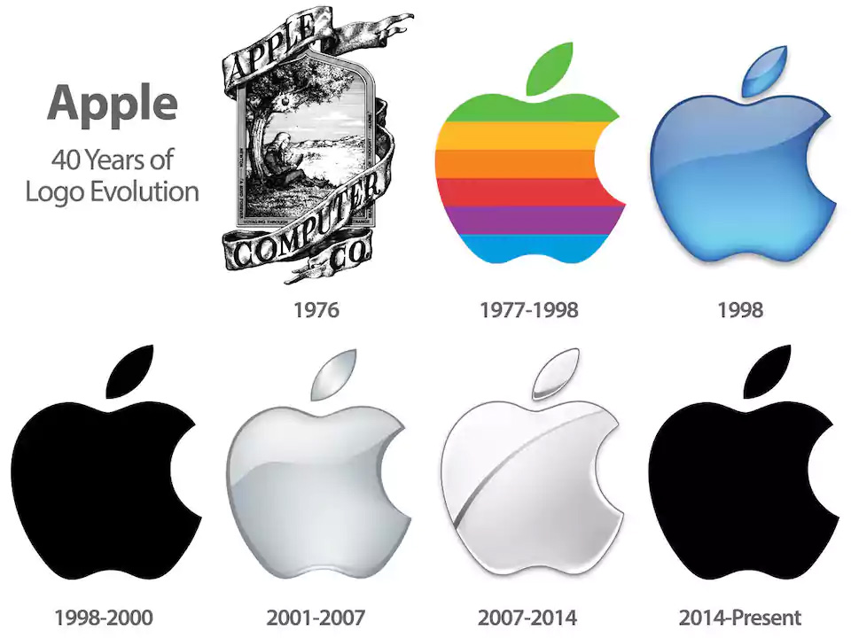
In 1998, the translucent logo replaced the rainbow striped Apple logo, which was then replaced by the monochrome logo.
It was because then Apple focused more on marketing by putting their large size logos everywhere and single colored logo gave them advantage to put it everywhere without worrying about the surface.
The Current Logo

This design is used by Apple till date in each and every product they make.
Now that we have discussed the logo history, let's discuss one fact clear that there was no change in the design of Apple since 1977 if we leave the colour changes that the logo saw.
Our next blog is about Why Apple logo is half Eaten? Till then wait and share this blog to your family and friends.