You have already read Apple Logo History and Evolution over time, so now it’s time to know the reason behind the half eaten Apple as the logo.
The designer of the Apple rainbow stripped logo, Rob Janoff revealed the two basic reasons behind the eaten Apple as the logo. In an interview with Creative Bit’s Ivan Raszl, Janoff said the first reason behind Apple logo being half eaten “I designed it with a bite for scale, so people get that it was an apple, and not a cherry or tomato”.
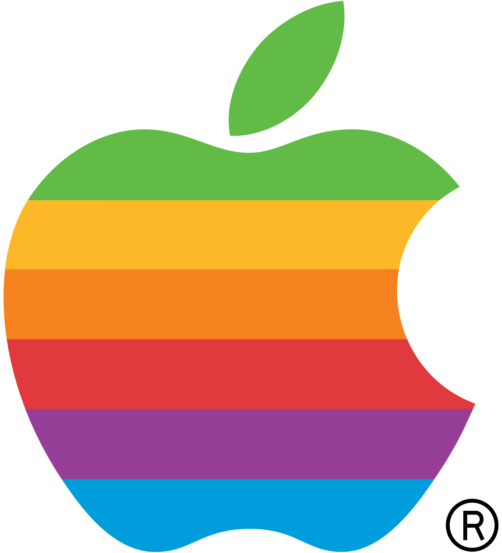
And the second reason according to Janoff- “Also it was kind of iconic about taking bite out of an apple. Something that everyone can experience.”
Though according to few people “The bite also played along with the computer buffs at that time because it had a similar sound off to the word ‘byte’, a unit of digital information in computing and telecommunication." but who knows what is the reality.
Apple is not the only tech company which has gone through continuous logo makeover over the decades. Here are few more examples.
Nokia
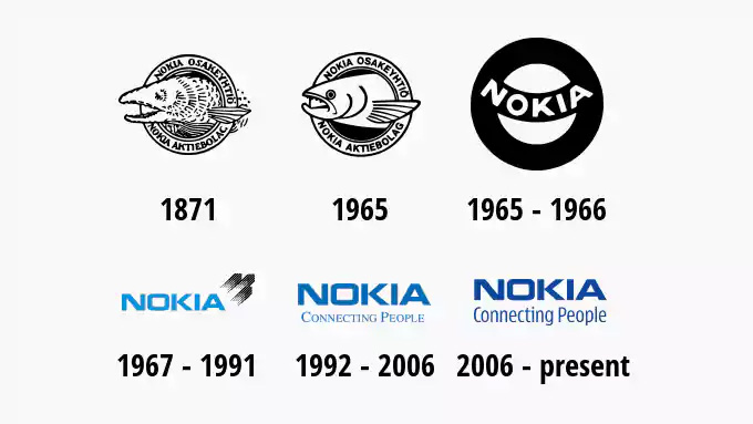
Finnish phone maker, Nokia has changed their logo a couple of time in the past.
Microsoft
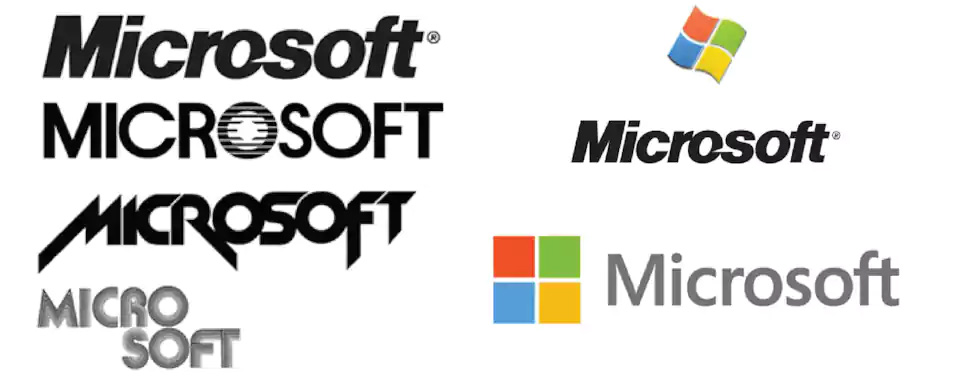
For the tech giant Microsoft, the last logo change was made in 2012 which is continued till now.
Google
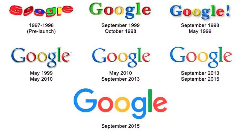
Talking about the tech giants, how can we forget Google? Google has always been introducing many small changes in the logo design but the big visible change came in 2015 when Google adopted a material design format. In 2015, not only the Google official logo but other sub-properties like Android came under material changes too.
Hope you liked the article and if you did, just share it!